Candid.org is a SaaS product that provides a directory of nonprofits/foundations and the critical information about them.
Across multiple product squads at Candid.org, I led complex, data-heavy features from problem identification through launch.
Key problems I got to address during my time were: simplifying account management experiences, reducing the friction points around registration, lifting personalized persona needs in visibility and creating clarity around strict government documentation criteria.
My work focused on decision-making under constraint—balancing user needs, business goals, and technical realities in a platform used by millions across the social sector.
Experience
Served as the sole designer embedded across three product squads, owning design strategy and execution for complex initiatives spanning B2B, B2C, and enterprise users.
I partnered closely with PMs and engineering leads to define scope, prioritize tradeoffs, and ship features that directly impacted revenue and user trust. Leveraging my marketing design background, I was empowered to craft UX copy and simplify user journeys for optimal engagement.
3 squads
1 designer per squad
UXR at every step
Impact at Candid.org
$35K revenue generated over 60 days
Directly contributed to revenue in 2025
20+ features shipped
Delivered new features to market
210K daily users impacted
features used each visit
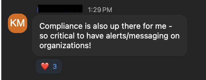
My work directly contributed to a 25% lift in registrations, revenue growth, improved search efficiency, and increased confidence (85%) in information discovery.
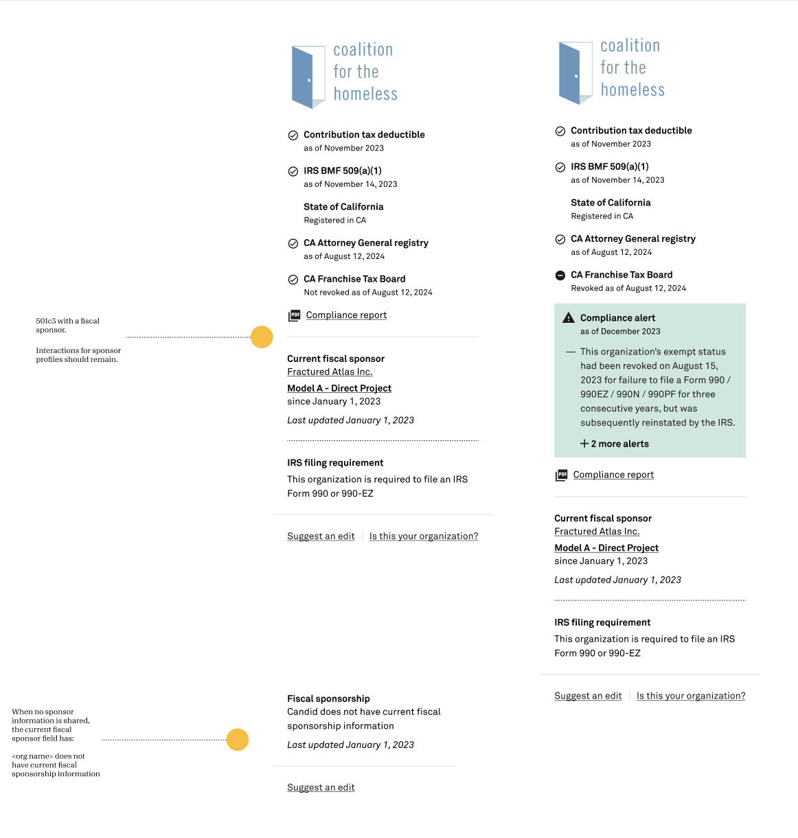
Challenge: Providing complex data in a simple-to-read interface that didn’t read as a reputation dark spot but provided critical context for users to make their own inferences about an organization.
Solution: I enhanced our compliance widget that surfaces critical data clearly while maintaining readability. This enables users to make informed decisions quickly and helped the platform generate $35K over 60 days.
Case study samples
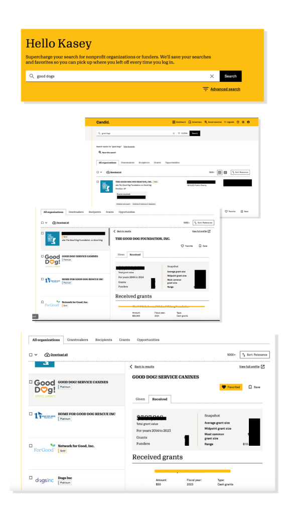
#1 Search experience
Context
Candid search anchors software that previously required two products. The new platform required search results that balance competing personas, pull from massive datasets, and manages performance constraints without fragmenting the experience. How would we add in data that was critical to one audience without bogging down the experience for all?
Challenge
Core personas value different data—nonprofits want grant details, foundations want complete profiles and organizational focus.
Role and approach
Worked closely with PMs and engineers to refine search flows, determine which data to prioritize for different personas, and ensure technical feasibility. My focus was on visual hierarchy, interaction design, and tradeoff decisions to simplify complex data retrieval.
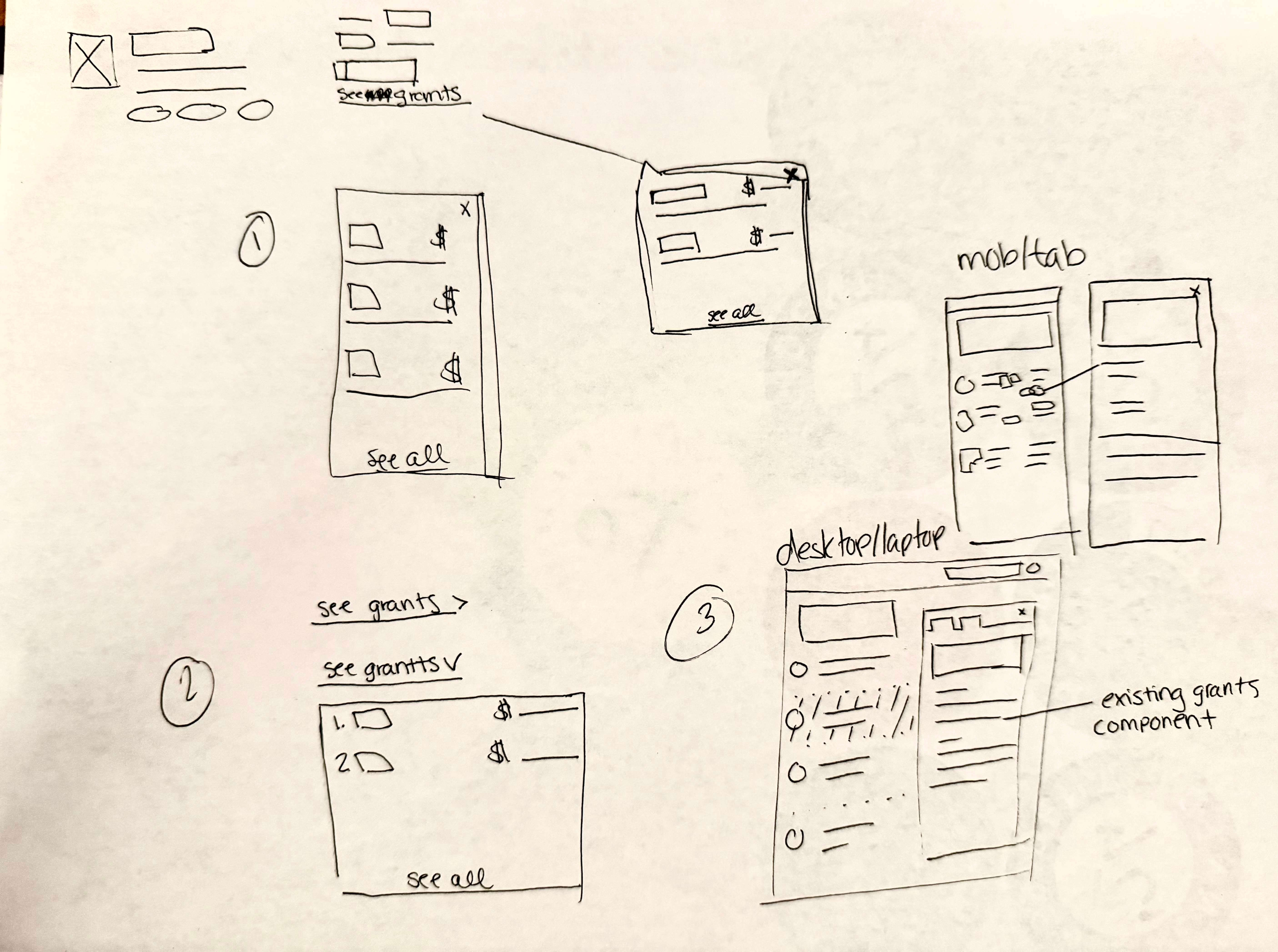
Our research showed users wanted more information without leaving the search experience. I advocated for interactive preview panes to allow users to access persona-specific details without leaving search results. Suggested tradeoffs between speed and content density to improve usability across user types.
Decision and influence
Incorporated feedback from user testing (2 prototypes, 20 users) to refine clarity and accessibility. Leave critical content visually prominent in the search result. Add interactivity with a preview pane that offers tailored content for each user’s needs.
Solution
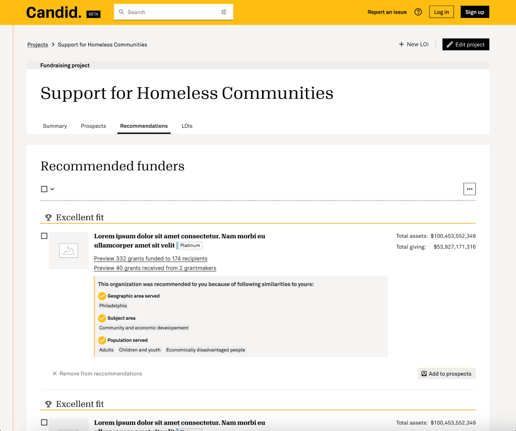
Keep our users anchored in their journey while easily referencing information quickly. The design was added to our design system as a component for scale.
Candid features this experience as a paid upgrade feature, serving as a value add and subscription funnel.
✅ 2 prototype designs tested
⏩ 75% faster data retrieval
⭐️ 4/5 score for user satisfaction
⏱️ 6 weeks from concept to launch
🚀 Launched to paid subscribers
Key takeaway
Demonstrated judgment in balancing competing needs, technical constraints, and user outcomes, while collaborating effectively with PMs and engineering.
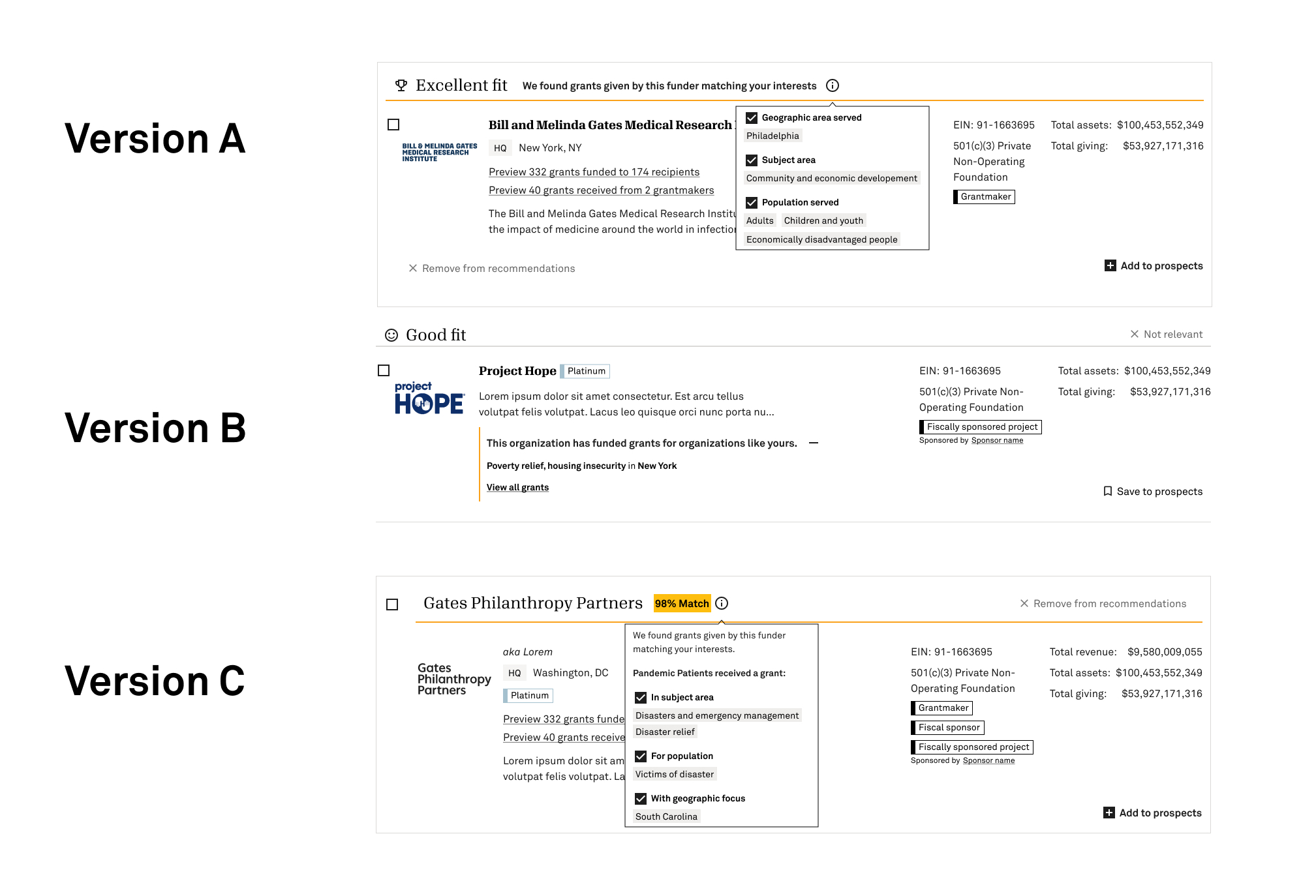
#2 Funder recommendations
Context
Users needed a clear way to evaluate how well search results matched their organizational mission, based on submitted data.
Challenge
The interface had to communicate alignment clearly, stand out visually, and avoid overwhelming users, while supporting both nonprofits and foundations.
Role and approach
Collaborated with PMs, engineers, and UXR to refine concepts, test prototypes, and make tradeoff decisions. My contributions included visual hierarchy, interaction patterns, and design recommendations to ensure clarity and usability.
Decision and influence
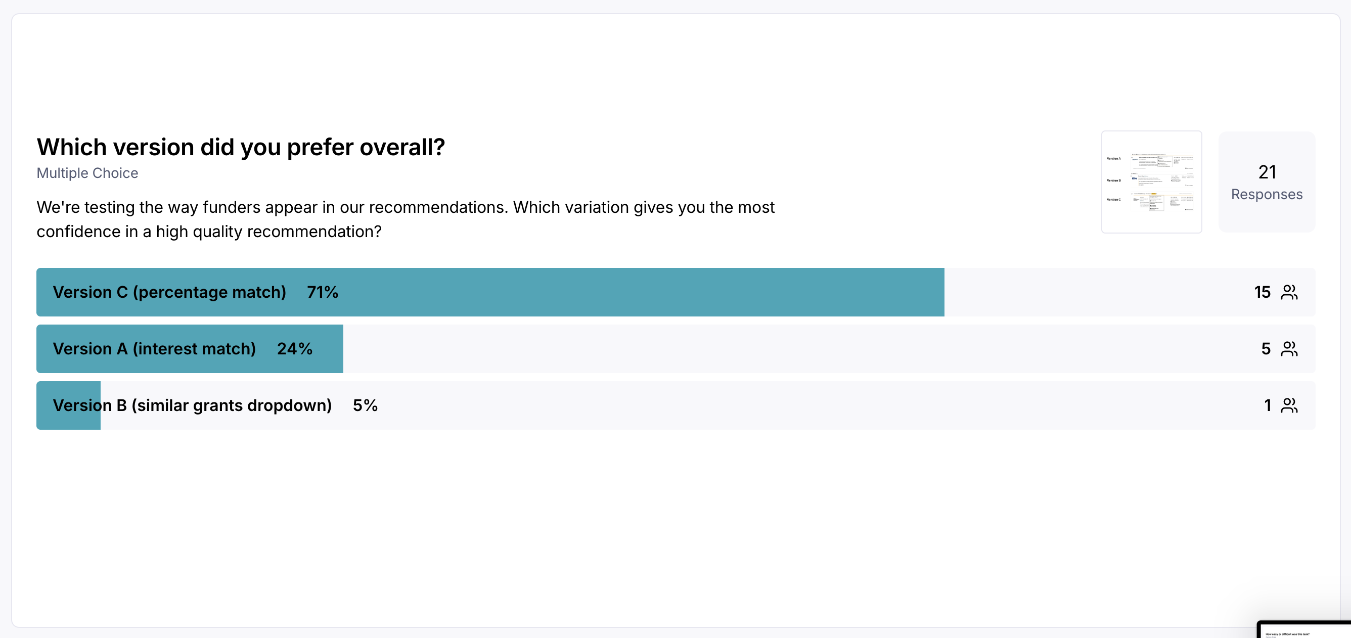
Explored competitor-inspired and original design concepts, selecting 3 prototypes for user testing with 20 participants.
Worked with engineering to implement the preferred solution while balancing platform constraints and scalability.
Solution
Design that emphasized visual clarity and transparency, capitalizing on market mindshare and prioritizing the information most critical for users’ decision-making.
✅ 3 prototype designs tested
👥 20 users participated in testing
💡 1 design chosen by majority preference ( 71%)
⏱️ 3 weeks from concept to launch
🚀 Launched to all subscribers
explore the prototypes
Key takeaway
Demonstrated senior-level judgment by making design decisions within a collaborative team, balancing user needs, business goals, and technical constraints, while delivering measurable impact quickly.
PERSISTENT WORK
Account management + purchase flow
Context / challenge
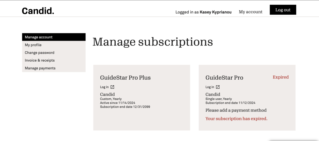
Subscription maintenance workflows were constrained by Salesforce platform limitations, creating friction for users updating or maintaining subscriptions.
Role and approach
When my role concluded, I was leading the redesign of subscription maintenance flows under Salesforce platform constraints, bridging gaps between design system and engineering limitations. I clarified user journeys, reduced visual clutter, and optimized flows for purchase completion.
1
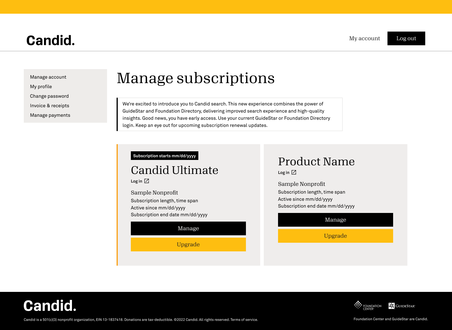
Reduce clutter: Simplified visual interface for clearer user focus
2
Map journeys: Optimized user flows for product selection and checkout
3
Bridge systems: Connected design system with platform constraints
Before
Decision and influence
Simplified the visual interface to reduce cognitive load while maintaining technical feasibility.
Optimized task flows to reduce clicks and errors, balancing usability with platform constraints.
Adapted design system components creatively to solve technical limitations and maintain consistency.
Solution
Increase revenue and subscribers across acquisition, onboarding, and retention touchpoints to reduce friction.
Streamline subscription workflows, improving task completion and user clarity.
Deliver design patterns that can be reused in future platform initiatives.
Increase efficiency and satisfaction for users performing subscription management tasks.
Key takeaways
Demonstrates problem-solving and influence by improving user workflows and enabling scalable solutions within a constrained technical environment.