Experimenting with intakes
A GROWTH & ACQUISITION CASE STUDY

Context
As someone with marketing history, I'm always testing our content to make sure it's the most efficient and effective way to get users to their destinations.
Candid.org has a vast database of data that we were building a search experience around. The information was all there (decades of it), but the UI required a ton of input to sort it effectively.
Users from the legacy software wanted a familiar experience, but merging together two softwares with two distinct personas required accommodating over 30 search filters. You don't have to be in product to know that is too many filters for a good search to run. While engineering got to work on integrating the legacy filters to retain our base, I challenged the thought that a boatload of filters was the best way forward.
I set out to run an experiment, one based on more personalized experiences like I'd seen work for growth teams and see if we could cut down on UI elements while also yielding smarter and more targeted results.

Setup
We wanted to test this in a contained space and require little to no engineering capacity in order to keep th team moving efficiently. My partners in Marketing pitched Candid Learning as an environment to test as it had content to navigate and a budget to work in.
New users exploring Candid’s educational offerings often struggled to understand which courses were most relevant to their goals. The existing experience relied on self-directed browsing, which created friction and drop-off during early exploration. It was an excellent opportunity to test a new intake approach, so I put out the call and gathered a small team.
I initiated discovery around quiz marketing and shared that a guided quiz should increase interaction and engagement.

Setup
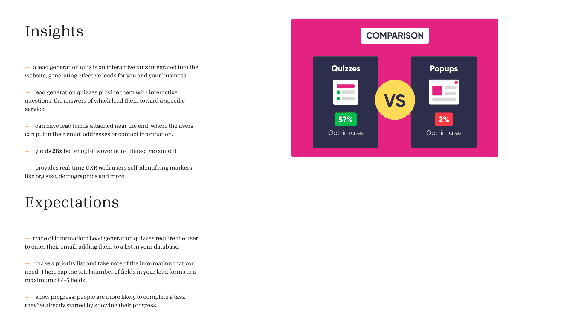
The research was promising. 28x better opt-ins. 57% vs. 2% for success rates in getting remarketing data. I shared this with managers across Product Marketing and UX and got enough buy in to test on Candid Learning's course library. We got to work on our project setup.
Problem
We started with creating our persona.
"Isla is interested in starting a nonprofit. She needs to know how to get funding and file documentation to get started but isn't sure where to start. She knows about Candid but the volume of resources is overwhelming"
Users needed guidance to identify the right courses without overwhelming them with choices. The challenge was to reduce cognitive load while maintaining clarity and trust within an existing ecosystem.
Hypothesis
If we guided users through a short, goal-oriented quiz during exploration, they would:
Feel more confident in their selections
Reach relevant content faster
Be more likely to register for a course
and we would:
have their email for retargeting
know more about the users seeking our product (role, time constraints, individual vs. foundation)

Role and approach
I led the end-to-end experience of a lightweight, quiz-based onboarding flow, partnering with marketing and our learning team to ensure feasibility and accurate measurement.
My focus areas included:
Prioritizing content based on historical data
Designing clear, progressive question flows
Creating multi-selection logic that adapted to user input
Writing UX copy that felt supportive (rather than promotional)
Ensuring the experience aligned with brand trust and accessibility standards

Solution
Partnering with colleagues across departments, we tested tools for the quiz. Once we decided on the best tool for the job, my partner from our Learning team compiled the list of most popular courses. We anchored our experience in these as our desired result as they had proven their value by their completion rates. Though we could have included a variety of courses, we decided to keep the experiment lean and promote 7 of our best trainings. I also raised that users might not have hours to complete full courses so the team curated playlists of our short form content to guide those on a time constraint. I wanted to have a valuable solution for each user that completed our intake.
My partner in marketing set up the experience in our quiz tool and we audited the workflow together, setting up the journey with progression clues (a progress stepper) and intentional placement of email ask before the end result was displayed. We needed to work around the guardrails of our platform, but I styled the quiz and it's visual assets to make sure it felt like a natural extension of our brand.
Ultimately, we created a 2 minute guided quiz that prompted users a small number of targeted questions to surface personalized course recommendations.
The design emphasized:
Progressive disclosure to reduce cognitive load
Clear visual hierarchy for scannability
Flexible logic to support multiple user goals
Direct transition from quiz to registration

Results
The experiment demonstrated a 25% increase in course registrations compared to the previous discovery flow. We had close to a 60% completion rate and users averaged 59 second from start to finish.
Users were not the only beneficiaries to this experience. Our marketing team gained:
User-contributed data for persona clarity
Clear validation of guided onboarding as an effective activation pattern
Key Takeaways
Guided experiences can significantly improve early-stage activation when users face complex choices.
Small, focused experiments can deliver meaningful impact without large platform changes.
Clear UX copy and adaptive logic are critical for maintaining trust in personalized flows.

Next Steps
Due to the success of this experiment, leaders took notice. After product launch, teams across the organization started rallying to scale the experince to other high-friction entry points.
My role at Candid concluded in early 2026 but in a future iteration of this approach I would advocate for:
A/B testing on question order and depth to optimize completion rates
Digging deeper to uncover if personalizing recommendations based on user role/organization type yielded increased opt-ins