Designing Decision
CREATING CONFIDENCE AND GUIDING DECISION UNDER PERFORMANCE CONSTRAINT

Context
At Candid, I led the redesign of grant search across a newly unified platform combining two legacy systems and a massive, fragmented dataset.
The challenge went beyond usability. We needed to enable multiple user types with conflicting needs to make fast, confident decisions despite tangible restraints from engineering and technological capacity. Through user interviews and usability sessions, our user research team shared our base was hesitant to change and we needed to share what they had historically seen first sooner as not to cause dropoff and frustration.
Impact
75% faster time to evaluate funding opportunities
Launched as a paid feature driving subscription growth
Improved user confidence and reduced search friction
Challenge
Enable users to quickly evaluate opportunities without overwhelming them or disrupting their search flow.

Problem
Building Candid.org the research team had clarified and validated a variety of personas for launch. For this problem, we needed to focus on two unique user types and their needs:
"Christina is a nonprofit manager who is seeking funding to further her mission. She needs to quickly evaluate where funders have given grants before so that she can see if her grant application is likely to be approved."
"Sayara is a funding manager seeking nonprofits that match criteria her organization seeks to support"
Both users were seeking grant data, but not the same data.
Each persona required different signals:
Nonprofits → likelihood of funding success
Foundations → alignment and past giving patterns
Candid's data was dense. Decades of historical and user-contributed data was immense and search would sometimes struggled to raise the relevant data quickly. We didn't want to push it harder, delaying result load or accuracy for the user on the front end. If we pointed them to another page we threw them off their journey and interrupted their research.
Our problem to solve became:
How do you support high-confidence decisions without overwhelming users or degrading performance?
Key tradeoff
We floated the idea of embedding more data directly in results, but this quickly degraded both performance and usability. It bogged down search and it affected the design system as the component for search results was shared across product in different variants. The team felt the pressure to have the product work more efficiently while needed a solution that could be implemented ASAP.
I made the call to:
limit initial data exposure
prioritize decision-critical signals
defer depth to secondary interactions
This meant we'd have to table less immediate transparency for faster evaluation and easier content to scan. Additionally, we would preserve the design system integrity.
Hypothesis
If we leveraged existing content within the result to provide a bridge experience to deeper data, users would get enough information to understand if an org fit their criteria for further exploration.
Reach relevant content faster
Be more likely to mark funder/nonprofit for consideration

Role and approach
Sole Product Designer
Led design direction end-to-end
Partnered closely with Product and Engineering
Defined information hierarchy and interaction patterns
Worked within an existing design system to ensure scalability and feasibility
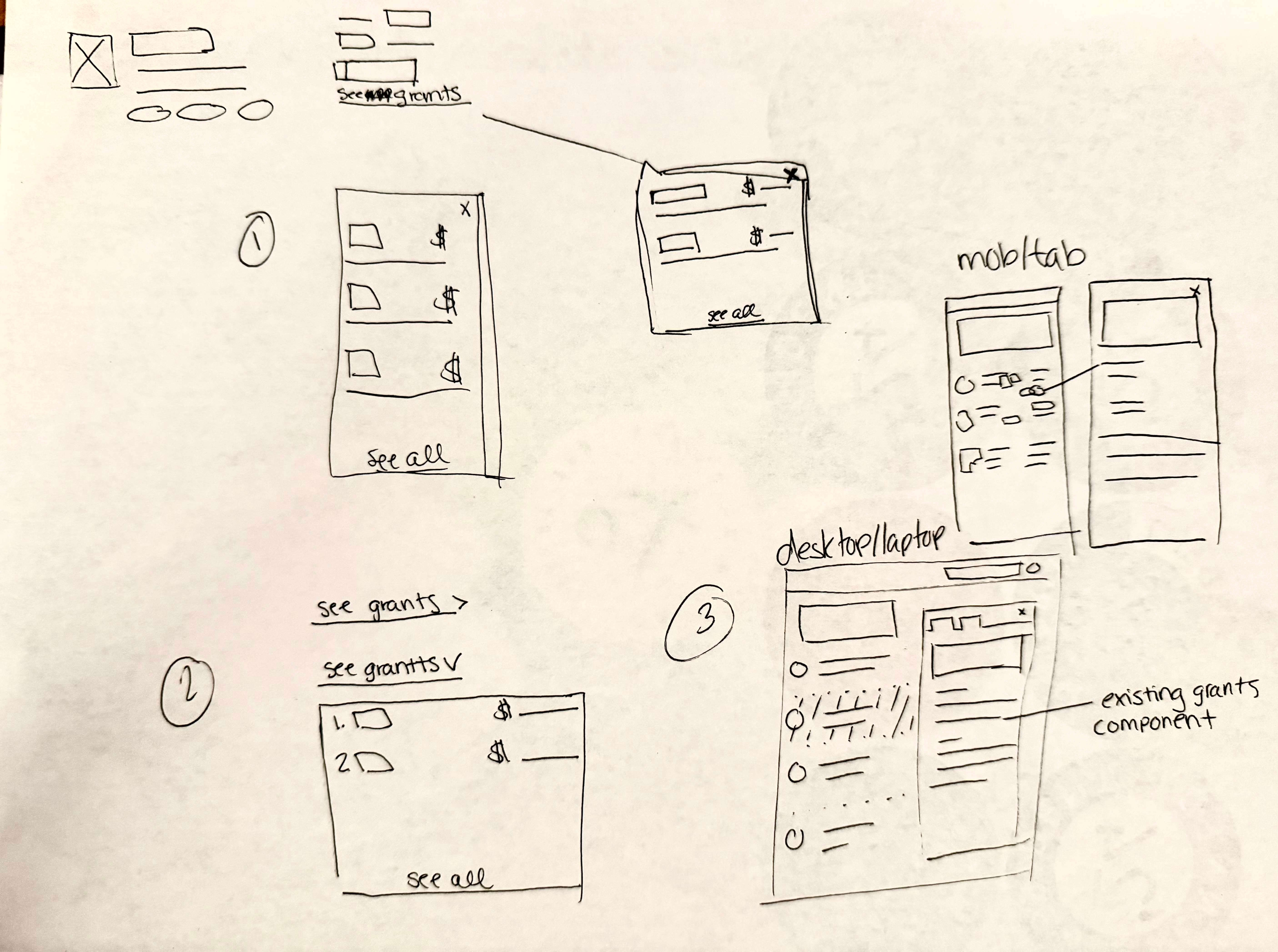
Transforming Search into a Decision Surface
Instead of forcing users to click into full profiles, I repurposed our help slide out into a preview pane that surfaced critical elements within the grants data.
This changed the interaction model from navigation-heavy exploration to in-place decision-making.
Users could compare opportunities rapidly, evaluate fit without losing context and maintain momentum across results.
This pattern reduced friction at the most critical stage: early decision filtering.
Key product decisions
1. Prioritize clarity over completeness
Focused on the minimum data needed to make a decision, improving scanability and reducing cognitive load.
2. Preserve context within search
Enabled exploration without navigation, maintaining user momentum and supporting rapid comparison.
3. Design within system constraints
Extended existing components to ensure consistency, reduce engineering lift, and support scalability.
4. Optimize for performance
Balanced data density with responsiveness, prioritizing speed and usability over exhaustive detail. I prioritized fast, usable access over exhaustive detail.

Design Approach
To get this off the ground I implemented:
Rapid prototyping and iteration with PM and engineering to validate solution viability
Two rounds of user testing
1. First round internal to align PMs across the product on what the search result would display and what would be left out
2. Second round to validate design among our dedicated product testers (5 participants). Usability findings drove navigation refinements and a UI color update to improve distinction of the selected organization in the list.
Collaborated cross-functionally with the search team to align on component changes as the asset evolved
Close collaboration with engineering to stay within system constraints
Continuous refinement of hierarchy and content prioritization
The focus throughout was:
Let's help users decide quickly, not just explore endlessly.
Business + User Impact
75% faster evaluation time for funding opportunities
4/5 user satisfaction across tested participants
Shipped in 6 weeks from concept to launch
Monetized as a paid feature, contributing directly to subscription growth
It also shifted user behavior from exploratory browsing to confident, criteria-driven decision-making.
Learnings
While this work focused on grant data, the underlying challenge is shared across domains like healthcare:
Navigating fragmented, high-volume datasets
Supporting decisions with incomplete information
Balancing performance with data richness
Designing for multiple stakeholders with conflicting needs
This project demonstrates how to design systems that help users use data to make decisions instead of just overwhelming them with an overload of information they may not need.